Tuesday, November 9, 2010

Simplicity is key

I'm alive, I promise! I know my posts have become few and far between but I'm still here and I'll try and do better. No promises though.

Today I was wandering around the good old internet using StumbleUpon and came across this image:

It made me laugh so I looked up Marc Johns and found a bunch of similar drawings. Voila, I have a new second favorite illustrator (Jon Klassen is and will alway be number one). His illustrations themselves are very basic but that's one of the reasons I like them so much. He picks a lot of common objects to draw but adds an unexpected element to them and there is always a little statement underneath. They are just so random and have a childish quality to them that not many artists have anymore. His blog will definitly be added to my list of daily reads and I have a feeling that my days will be a bit brighter because of it. Here are a few more drawings from his website:


I would love some of these prints to hang up in my room, hmmm, I'm thinking Christmas list!


May X never mark just one spot!

Kim


(Images from marcjohns.com)

Thursday, October 28, 2010

Check It Out

I was just going through my bookmarked pages and rediscovered this site. You might have been there before but I thought it was a very pretty way to waste a few minutes. It's in Spanish but you don't have to read anything to enjoy the site. It's also a FWA people's choice website which doesn't hurt.


May X never mark just one spot!

Kim

Tuesday, October 26, 2010

I love claymation!

This past weekend I stumbled across a movie on Netflix that I had never heard of before called Mary & Max. I was just browsing the independent film section for something new to watch when I found it. I didn't really know what to expect but I soon as I read the words "clay animation" I was hooked. I thought it was going to be a kids film, beautifully animated and I was okay with that, little did I know it would become one of my new favorites. The story is about two people, an eight year old girl from Australia and a middle aged, obese man with Asperger's from New York who become pen pals and is definitely not a kiddie movie. Do you want to see it yet? Because you should. I hate it when people give away to much in a story line so I'm not going to say anymore about that. You'll have to watch it to find out about Mister Alfonso Ravioli, Damian Cyril Popodopolous, and Mister Biscuit (who is a parakeet), to name a few. 

Adam Elliot is the masterful director behind this film and has done several animated short before Mary & Max. The animation is absolute perfection. The whole film has a very minimal color pallet which works great for the story line. All of the characters are a little wacky looking (some more so then others) but just makes the film that much more charming. The details are also incredible and just help to add to the humor and sarcastic tone spread through out the film. Just check out some of these screen shots.


And to top it all off, Toni Collette (who I'm absolutly in love with) is the voice of Mary. Philip Seymour Hoffman and Eric Bana also voice main characters. So now everyone should run and watch this movie, you won't be disappointed I promise!


May X never mark just one spot!
Kim


(Images from listal.com)


Wednesday, October 20, 2010

For a Cloudy Day

The other day I was trying to find some inspiration for a website I'm working on for my internship when I came across these lovely folks. The Cloudy Collection was started by David Huyck who one day decided to invite some friends and colleagues to make a collection of letterpress prints. The results are beautiful prints that show off each designers unique talents but still work as a cohesive group as they all follow a theme and they have the same color pallet. They currently have 7 collections out with an average of  7 or 8 prints per set. They also are super eco-friendly when it comes to printing which is something that I think is very important this day in age. 


I admire anyone who reaches out to other designers and artists to create something beautiful and exciting. I think that in the creative field it is so important to have other creative people around you to both inspire and support you. I know that I have my group of people that I always look to when I have designer's block or just want to bounce around a few ideas. I currently have two side projects with two different sets of friends that I'm hoping are going to take off soon. They are both really different projects but are each so much fun because I get to work with other designers who are also really close friends of mine. I think that sometimes working in a group can be really difficult but is usually worth it when everyone's best ideas come together to make a great finished product. I'm purposefully not giving away any specifics but as soon as there is something concrete to share you'll be hearing it first, I promise!


In the meantime here are some of the prints from the Cloudy Collection. 


I definitely think that my favorite theme is "The Scarlet Lettering" (Vol. 1 Issue 3). Make sure you check them all out at their website, cloudycollection.com. They come out quarterly so there should be a new "issue" in a few months. Enjoy!


May X never mark just one spot!

Kim

(Images from cloudycollection.com)


Friday, October 15, 2010

Can someone help me, please?!?

I am absolutely dying to learn how to print color photos in the darkroom. I've heard that it's complicated and hard but I don't care, I've wanted to learn for a while now. Color photography skills in the darkroom creates so many new possibilities. I keep on trying to find a class on color photography but so many people are switching to digital now that the classes that are in the darkroom are mostly on the basics. I've taken three photography classes now and want to learn something completely new. Does anyone out there know of a color photography class (in Boston) or know themselves and want to teach me? I'm getting pretty desperate here.

My other problem is that I don't have a darkroom so I can't even teach myself (which believe me would be very entertaining for all of you). The wonderful thing about being in college is that everything is right at your fingertips. I've been realizing since graduation exactly how much I depended on the school's resources. Let me tell you, I was VERY dependent. And now it is all gone just like that. I honestly haven't looked at all for a public darkroom in Boston but I did look when I was in Virginia and found nada so I'm a little pessimistic. Although that was Virginia and this is Boston so I probably should give it a chance. Even if I can't learn to print color photos I would still love a darkroom to play around in. I love darkrooms, they always feel comforting and safe. Oh why can't the real world be more like college? Tons and tons of art resources for everyone!

Well while I continue my search for a darkroom and color photography class here are some photographers who use color film (at least I'm pretty positive they do, either way they're all worth checking out):


Rineke Dijkstra
Beach Portraits
(Imgs: www.vincentborrelli.com )


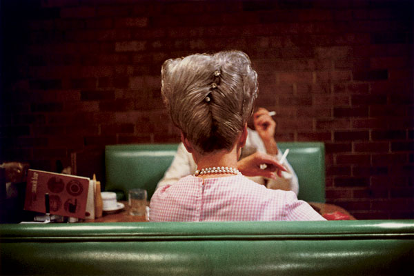
William Eggleston
Los Alamos


Joakim Eskitdsen
The Roma Journeys


I hope you enjoyed! I found all of these artists on this website. It's a great resource for finding both classic and contemporary artists.You should definitely spend some time there, it's where I always go when looking for photographic inspiration!


May X never mark just one spot!

Kim

Wednesday, October 13, 2010

A Burst of Inspiration

I think that it is about time I dedicate a post to my all time favorite illustrator, the absolutely amazing Jon Klassen!  His quirky style and use of textures really make him stand out as an artist. His work usually has an almost childlike simplicity to it yet also has an edge of  dark humor. Check it out...

This is one of my favorites if I was forced to choose.
There is definitely that dark humor that I mentioned.

Beautiful!!! Great illustration of isolation, it's kinda sad and sweet at the same time.

This is so amazing!!!!! I want all of his prints!


Oh and did I mention that he did artwork for Coraline? Because he did. I know know, how much are you in love with him? I want to post all of his prints but I'll let you look for yourself. Also check out the image he used for his about me page. I think I might have to still that idea, it's too cute!


May X never mark just one spot!

Kim

(Images from burstofbeaden.com)

Monday, October 11, 2010

BOSTON!!!!

I am here. I am in Boston. Right now, as I write this, I am in Boston, Massachusetts. It happened so fast that I barely believe I'm here, but after 13 hours of driving (there is a reason I'm a disoriented artist) over two days, I AM IN BOSTON! I actually got here on Friday but had to unpack and all of that. I know it's been over two weeks since my last post but I'm back and better then ever!

Great poster by Ork Posters, they have a bunch of other cities too!

Today was my first meeting with my boss at my internship and I think I'm really going to like it there. For those of you wondering what my internship is here is a brief overview. I'm interning for a Boston based DJ, doing all sorts of graphic design projects for him. He owns his own DJ/production company and an event promotion company. He is also working on setting up a DJ collective that consists of three DJ's, the twist being that the three DJ's are really just all him with a different identity for the three different genres of music he will play. I don't know if I explained that quite right but I hope you get the idea. Anyway, that's where I come in. I, along with his other graphic design intern, will be creating a site for each of the three identities as well as a site for the collective.  It's going to be a lot of work but he really wants sites that are creative and fun so I can't wait.

Beat Train Productions (the NY branch)

In honor of my new musically inspired internship I thought the second half of this post should be about some album art. I've always loved album art, I think that it is one of the best way to be a commercial designer but still have a ton of freedom to be creative and experiment. My boss had a bunch of old album covers framed in his studio which I thought was very fitting and looked great. Here are a few album covers that I personally adore.

The Decemberists- The Crane Wife
Illustration is by Carson Ellis
(Image-decemberists.com)
The Decemberists- 5 Songs
Illustration is by 
Carson Ellis
(Image-
decemberists.com)
Santogold- Self-titled
(Image- amazon.com)

Tilly and the Wall- Bottoms of Barrels
(Image- tillyandthewall.com)

The Black Keys- Brothers (just in case you weren't sure)
(Image- theblackkeys.com)


Ben Kweller- Sha Sha
(Image- goodrecords.com)

She & Him- Volume Two
(Image- sheandhim.com)

It's alive!!! I'm not such a fan of the color scheme or even the pattern but I do love how trippy it is.
Animal Collective- Merriweather Post Pavilion
(Image- 
drewtewksbury.com)


Now I do realize I left out the classics but everyone has seen those a thousand times, so why should I repost? And these are also mostly from music I listen to, so I'm probably a little biased, but it's my blog so that's the point I guess. It's a very diverse group but I think they all have something that really makes them stand out. What's your favorite album cover of the moment?


May X never mark just one spot!

Kim

Friday, September 24, 2010

Tennis Anyone?

A month or two ago I came across an iPod Touch app called Layer Tennis. I was just searching around for graphic design and art related apps so I didn't really know what to expect. What I found was pretty cool.

Every Friday there is a new match between two designers, each match consists of 10 "volleys". As in the traditional game of tennis there is a serve. In Layer tennis the serve is a file that one of the designers made before the match started. After that the two designers send the image back and forth adding on and changing the image. After each volley the image is posted live on the site and there is a commentator for each match giving often funny and interesting opinions to what each designer has to offer. The most amazing thing to me is that the designers only have 15 minutes for each volley. I repeat, 15 MINUTES! The things these people do is so well done and creative. They never know what the other designer is going to do yet the manage to bring their best. After each match people who hold a "season pass" (myself included) can vote for who think they won the match on Twitter

Adobe does sponsor the site so that automatically tells you there are going to be some high quality designers featured and I haven't been disappointed yet. I admit I've only just gotten to season two (they have three seasons so far) but it is such a great idea and they all know how to deliver. I love match one and four of season one, they are both must sees. Things also start to heat up when animation is added to the equation in a couple matches towards the end of season one.

Season 1, Match 1, Volley 4, Shaun Inman

If anyone wants, I'm totally down for starting our own Layer Tennis Competition. Anyone game?

I don't think that I'll ever be able to watch a normal game of tennis again (not that I ever really watched tennis in the first place). You just never know what to expect, each match is so different.


May X never mark just one spot!

Kim


(Image from Layer Tennis)
Thursday, September 23, 2010

A Little Snapshot

Like I mentioned a few days ago I did a little project that I wanted to post about. This piece is a part of a series that I'm working on. They are lino cuts (one of my favorite medium) that I digitally made into little posters. I have three on my website and this one will get on there soon. In order to prove my absolute adoration with photography, each image is of a camera, so far I have made a print of a Holga (love!), an old Olympus 35mm, a Voigtlander Brillant, and now an  Ansco Cadet. I own each of the cameras I've made a print of except for the Voigtlander (that's my next camera, or at least some kind of dual lens).

The Ansco Cadet is actually my Mother's but I just found out she had it about a month ago. Now, I've been seriously studying photography for about the past two years so why she didn't tell me about it earlier I have no idea. She didn't tell me about it until my Aunt and I were talking about cameras that might be in my grandfather's attic. It was her first camera, my two Aunts also got one each. When I asked why she hadn't told me about it before she said I never asked. I didn't know I was supposed to but that's my Mom for you.

Anyway, on to the goods. I took a bunch of photos of my process so I thought I would share.

Isn't it so cute?
And the box is amazing! Thank God for my Mother's pack-rat tendencies!!
First I made sketch,
Then I made a pencil rubbing of the drawing,
The first round of cuts,
Then I go in and add different widths of lines and make sure all the cuts are deep enough,

I thought I'd give the blue ink a try,
The ink is a little thin but it was just a test print and no I didn't mean to match my nail polish to the ink,
Gotta make sure all the ink is transfered,
Tada! Again, the ink is a little thin but not bad for a test print in my opinion.
The end.
So that's my little project for the week, hope you enjoyed!


May X never mark just one spot!

Kim